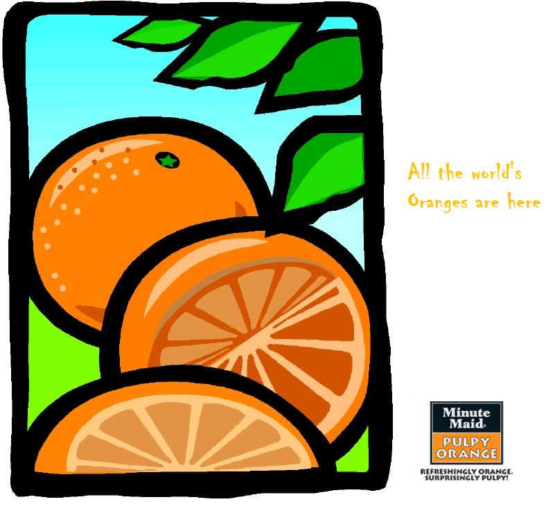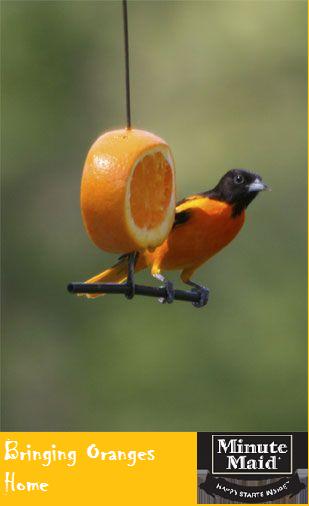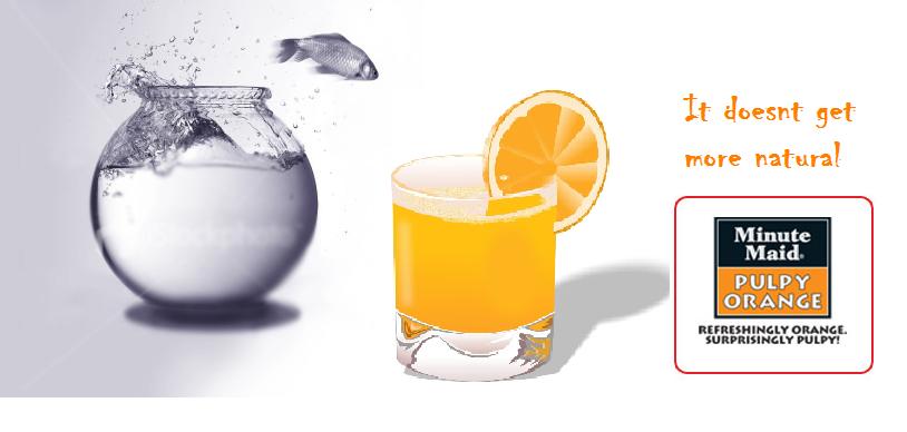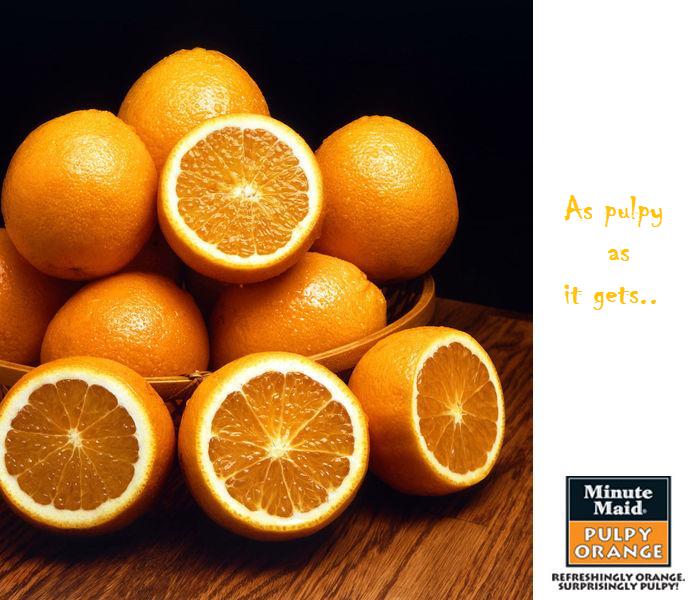


These are a few print ads that our group came up with as part of an assignment to advertise Minute Maid's Orange drink. This is a new soft drink in India, introduced by Coca-Cola. The USP of this drink is the pulpy nature of the drink which sets it apart from the rest of the competition. The drink is targetted at young adults and the brand ambassador in India is the popular VJ Nikhil Chinnappa. The main competition for this drink would be Tropicana.
It remains to be seen how Pepsi responds to this product.


8 comments:
You guys designed the posters for Minute Maid?, or you guys analysed the posters for a case study types?
@kuku:
we designed the posters from scratch.. in 2 hrs man...it was exciting!
wow! you are rocking...
great work and amazing posters! I am sure coca-cola wud have sent in their "job offer requests" :P
dude 4th and 5th one are awesome... did u guys do everything from idea to posters???? dude, when I start my company, you have a job man :)
Damn cool man. So you guys designed these posters after the ad runs on TV or were those ad runs a part of your designs? Who gave the concept of "Where's the pulp?" ?
@all:
A small clarification...these ads never went on air or anything...these were ads which we desgned for the workshop...that's all. :)
can i have a few more of these???
great work ....
great creativity....esp. the fish ad is good.
m also interested in such creative works...for that where i can get technical know-how???
Post a Comment